CI
See TWICAP’s Corporate Identity
TWICAP
Twist and Drink it Two! Emphasizing Functional Dispenser Cap’s Highlight Feature,
Twist to Drink Two together.
![]()
This simple, continuous wordmark captures the meaning of TWIN and TWIST in the brand name.
The continuous lines in the logotype visualize the connections between innovative ideas and technology.
![]()
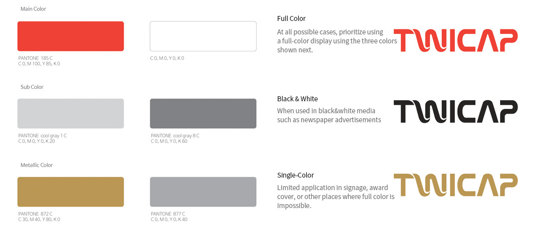
Wordmark is the most crucial representation of TWICAP. To present a consistent brand image, strict management of use is required and should not be used arbitrarily at the risk of damaging the brand image. Therefore, when using the wordmark, use the following grid system or computer CD-ROM data to maintain the precise proportion during resizing.
Brand Colors